About...
Grab This Blog's Widget! < Amarettogirl
visual artist and writer marisol diaz

i am a self-defined Nuyorican creative (that is a Puerto Rican who is from both the isles of Manhattan, NYC and the Caribbean). I share daily in the joy of education and live in a cute port town in New York, in a 'teensy-weensy' apartment with my two dogs and canary named Valentino. Check out my Etsy shop for purchasable pieces. Please do not reproduce imagery off of this site without explicit credit and no derivatives may be made of my original imagery- Thank You.

Creative Commons License
This work by marisol diaz is licensed under a Creative Commons Attribution-NoDerivs 3.0 Unported License.
Add to Technorati Favorites
pingg Invites & eCards
bloglovin
Sunday2.1.jpg
MondayArtdayButton.jpg
amarettogirl. Get yours at bighugelabs.com/flickr
3ww1.jpg
pingg Invites & eCards
Grab This Blog's Widget! < Amarettogirl
CRAFT: I'm a Crafter!
The Small Is Beautiful Manifesto

Entries by Amarettogirl (339)

Sunday
Jun222008

The Potential of a Brown Paper Bag

marisol%20botar.jpg

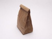
This post is a blast from the past...seeing as I didn't have a blog to brag in the past, I'm taking advantage now. Quite a few years ago, I found a phenomenal Hawaii based artist named Moses who was featured as the 'Mad Hatter' in the July 2000 issue of the Smithsonian archives. Moses is a an artist that made an extraordinary series of hats from a simple brown paper bag.


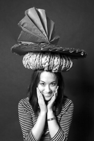
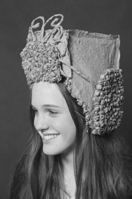
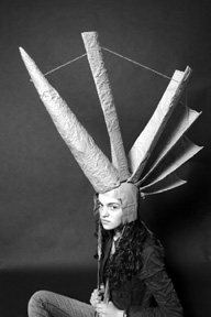
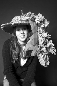
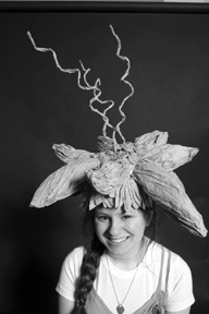
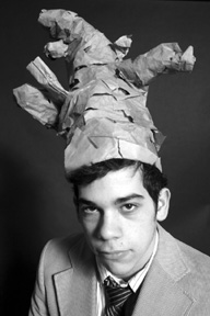
As some of my readers know I teach high-school visual arts at the Englewood School in Englewood NJ. To begin the spring term of the Studio Arts II portfolio development class that focuses on the three-dimensional arts, I presented my class with some inspiration references from both Moses, and the design show Project Runway to see what they could do with lots of 250 brown paper bags that I got from a local dollar store.


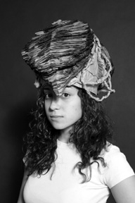
These days I can no longer find the site, luckily blogger Mr.Paper's Blog did a write up on Moses that showcases Mose's phenomenal paper bag hats. Please click on the link and check it out!!! I was so inspired, I had my students explore principles of design through the designing of their hats and years later I am still blown away by the results. They were allowed to pierce, sew, wrinkle, fold, cut, burn, shred, layer, glue, braid, paper mache and anything else they could think of to their bags. I am so proud of these now alumni students and the job they did honoring Moses and his work, as well as invoking their inner designers.


So this is what they come up:

marisolbotar2.jpgmarisolbotar3.jpgmarisolbotar4.jpgmarisolbotar5.jpgmarisolbotar6.jpgmarisolbotar7.jpgmarisolbotar9.jpg

marisolbotar8.jpg


Don't Forget to post your 'rainbird' comment on the giveaway post (two posts back) to win your print - I am getting some amazing comments and it will surely be difficult to choose! One person suggested the winner should also do a giveaway - that would surely be in the nature of Guerilla Art so I think its a great idea!!!!!


Friday
Jun202008

Hair Art! Play With Your Hair!!!

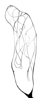
So if you have long hair like I do...or any hair for that matter, consider playing with all that hair that falls out during a shower and make art!!! Take shower art to a whole new level!!!

hairalone.jpg

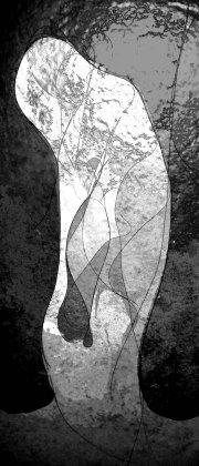
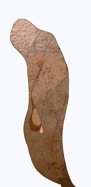
So here is an image of my hair alone on the shower wall after I pushed the wet hair around to create a semblance of a figure. Using a photo editing program (in my case photoshop) I cut out the (visually noisy) tiled wall background around my hair. Then I simply played with the photo editing program as though the lines of my hair were stained glass or coloring book lines. Check out the results:

shower%20art1.jpg

This may not your typical ''pretty' art but I love the creative exercise it offered me. You can play too - Try it!!! And if you do - let me see it I would LOVE to check it out!!!

showerartIII.jpg


Before you run off to play with your hair, don't forget about the art giveaway comment!!! The deadline is the fourth of July!!! Scroll down to the past post to see the prize and comment!!


Tuesday
Jun172008

Guerilla Art and First GIVEAWAY!!!!

rainbirds.jpg


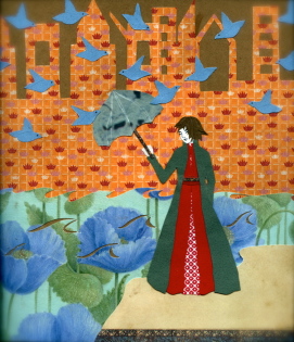
So thanks for waiting so patiently!!! The first monthly giveaway piece is ready to go!!! So here is how and why I am doing this giveaway of art (in this case A SIGNED PHOTOGRAPHIC PRINT of a collage art piece that I made for Illustration Friday prompt; Forgotten. The collage you see above entitled 'Rainbirds'.)


1915508-1651832-thumbnail.jpg
Guerilla Art Kit by Keri Smith
I'm a big proponent of Guerilla Art (you may have seen the book in my suggested book list). In the way we often think of small random acts of kindness making the world a better place - with Guerilla art Keri Smith shares her vision of small random acts of ART making the world a better place. Often the art is 'anonymous' (which is a beautiful way to do something selflessly) for example: you're scanning a book or magazine in the bookstore and out between the pages falls a drawing left there purposely for you to find, keep or pass on...and you know not by who, such is the nature of Guerilla art.
I think those of us in the blogosphere can adopt this idea even if not anonymous, and I have already seen creative bloggers out there begin to do 'Giveaways' where the payment is not monetary, nor even an object of equal value, but instead the payment is made in an exchange of connection. Such was the case with my wonderful blogger friend BEATRIZ, a fellow artist living in Italy - her blog http://suitcase-contents.blogspot.com/, is listed under my favorite bloggers list and has already completed her first giveaway!!!


So here is how it is going to work. I will pick the receiver/winner of the photographic print on the Fourth of July through those who have left a comment!!! It will be my way of celebrating independence and I will choose the receiver/winner by reading through all the comments left for the print and seeing who left a comment that truly touched the answer to my comment question. So here is your comment question:


In this collage I use the parasol as a symbol of bidding fairwell...though goodbye's can be somber and difficult aspects of our lives - they can also be releasing and un-inhibiting, as well as a form of independence. This is why I entitled the piece Rainbirds...the rain has set her free - flight - birds...so what is your Freedom-Through-Goodbye story??


Leave me a comment and I will choose from among you - but if it becomes too difficult to choose I will use a random number generator to help me choose. You have from now to the fourth of July (which is over two weeks) to comment - please be sure to leave your email address with your comment so that I can contact you! I will announce the winner and their blog on the fourth of July post.


Sunday2.1.jpghttp://sundayscribblings.blogspot.com/
Friday
Jun132008

Music and Creativity (part I)

I have been fortunate in these past few months to engage in, experience and be an audience member in yet another form of artistic expression: music.

For those of us 'visual creatives' who have always appreciated the strong bond between creating art and listening to music, this post will surely delight.

As educators, my husband and I have embraced the interdisciplinary potential of music and art in the past. However, lately we have truly begun to push the union of these two art forms in the classroom - particularly due to the fact that for the last three years we have had some amazing visual art students cross our path that are also extraordinary performers (you'll read more about that in the post to follow this one (Music and Creativity II/ Sons of an Illustrious Father))...many of which are residents of Nyack, New York, a town whose businesses have really supported young talent.

Still, even when students/artists are not DUAL in capacity of music and art (I'm certainly not), and don't live in Nyack...(I no longer do) the two genres of music and art feed each other so well that the creative process and studio life can almost not be fully realized without it!


So check out this short (around 4min) video I made recently of a few of this year's graduates, including student musician Josh Walteros, as he volunteered time out of his schedule to perform for one of my husband's senior selective figure drawing classes.


I am still always so amazed at just how much music can emotionally move me and drive me to physically create. In this case the students were left not only to study the figure and its inflections in a motion, but to respond to the music in any way they saw fit, even if just embracing color and lines.


Monday
Jun092008

Cleopatra- A Contemporary Revision

These days I'm posting about the Herstory Exhibit. The first post can be found through the blog archives under Herstory. Then be sure to check out my revision of Judith and Holofernes, and The Three Graces which can also be found in the Blog Archive. They are all categorized together now!


1915508-1634472-thumbnail.jpg
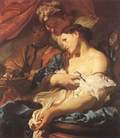
The Death of Cleopatra by Johann Liss

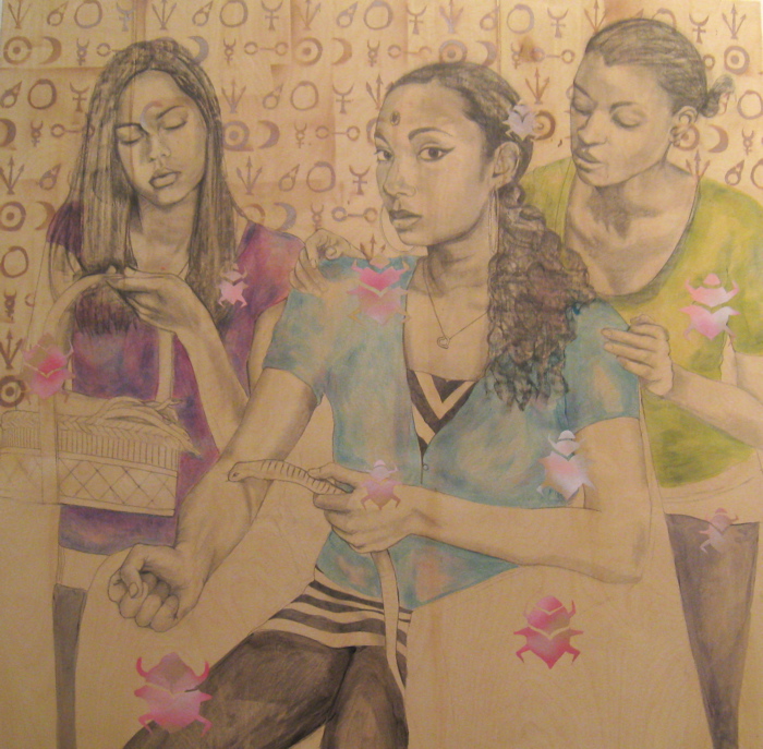
I based my revision of Cleopatra on the composition by Johann Liss from 1622 entitled the Death of Cleopatra. I am always so amazed at how many artist renditions of Cleopatra offer a very fair skinned version of Cleopatra with cognizance of ethnicity when it comes to the handmaids and servants. Despite contemporary rhetoric on the true origins of Cleopatra and her heritage, many of these paintings were painted at a time when all anyone knew was that she was queen of Egypt. Notice the two figures surrounding Cleopatra in Johann's version. There is the figure holding the basket of asps and figure leaning over to get a better look at the definitive choice of death.


IMG_7333.jpg

The above piece is entitled, Cleopatra's Alchemy. It is done with graphite, liquid acrylic glaze and spray paint on raw wood. It is around 36" x 36" I wanted to focus on the fact that many people don't realize Cleopatra was an avid scientist and alchemist. She studied poisons and therefore knew the most effective way with which to end her life when she chose to. I hand-cut stencils with the alchemical symbols of mercury, gold, silver and the ouroboros (the snake eating its own tail) to demonstrate her wisdom. Alchemy also lends itself to the idea of reincarnation...


1915508-1634491-thumbnail.jpg
Cleopatra photo by marisol diaz

My husband (artist Gregg Emery) feels quite passionate about the photos from the Herstory project being a very different body of work than the paintings and thinks they shouldn't be butted up against each other (like I did in the last post). I am going to agree. So I am including only a small thumbnail of the image here:


Models: Ally Rodrigues (with basket), Maya Guneseharan (Cleo), Dana Butler (onlooker)


As you can see, I altered many things from that springboard photograph. The most satisfying part of creating the artwork was discovering the aesthetic satisfaction and power of working on a raw unprimed surface like that of wood. In the detail shot below you can have a better sense of the raw graphite line and the natural grain of the wood working together.


IMG_7150.JPG


Well, we're in June and school is almost FINISHED (I have two days left!!) Which means it's almost time for my first GIVEAWAY post! So stayed tuned and look out, because before June is out I will be posting a Giveaway Collage Post and selecting a 'winner' from the comments to mail the small piece of artwork to for free!


Saturday
Jun072008

The Three Graces - A Contemporary Revision

As part of showing pieces and parts form the Herstory exhibit, which you can find past post on through clicking on my blog archive, I am following the Judith and Holofernes post, up with the Three Graces based on the 16th century Raphael's version.

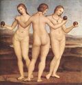
If you don't know Raphael's Three Graces here it is, but I encourage you to click on the link to read more about the source:1915508-1628696-thumbnail.jpg
The Three Graces by Raphael, 1501-1505


ThreeGracesR.jpg


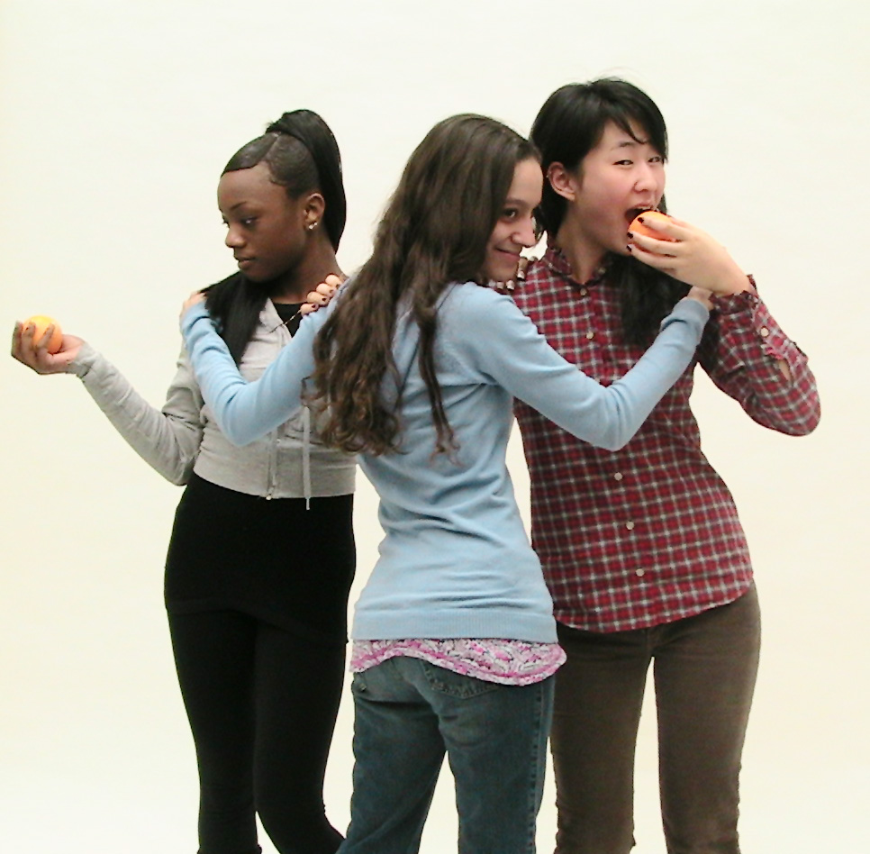
I really love the photograph I took, more than the painting I made, that doesn't always happen that way. Actually, this photo is one of my favorite in the series. That is due to the spontaneity of the altered composition.
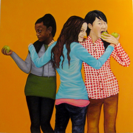
The models from left to right are Crystal Fraser, Sadie Casamenti and Yeon Hee (Sophie) Kim. We began posing with a serious literal translation, and being silly between shots created this version when model Yeon Hee(Sophie) Kim chose to pretend to eat the apple. A you can see, we didn't have 'golden apples' (though some say that's what oranges were called at the time) and our middle model (Sadie Casamenti) didn't have one at all. That was something I chose to rectify in the painted version. Three Graces are the personification of grace and beauty and the attendants of several goddesses. I thought this NEW pose, to be so much more empowering than the original version and truly more contemporary in meaning (a play on feminist rhetoric to be taking a bite out of the fruit - the all time symbol of fertility) that it became the one shot I chose.


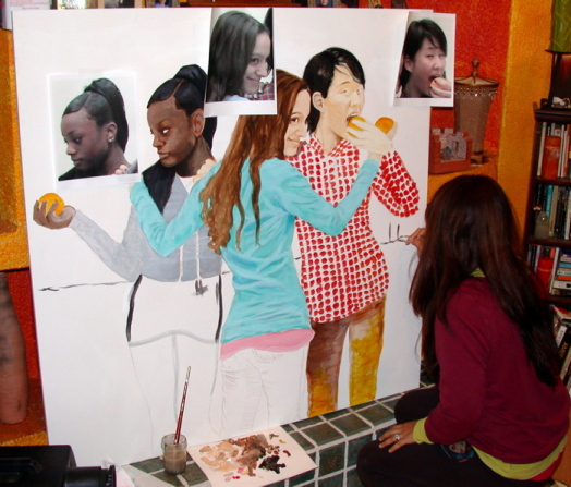
threegsprocess.jpg


I struggled with the painting mainly due to my indecisiveness about the environment (at first I wanted them standing on a New Jersey overlook of the NYC skyline), but I changed that idea quickly. The flat background came after a visit to some Chelsea galleries and seeing some inspiring work that abolished that self-restricted notion of active, engaging composition. In addition, the environment I was working in at the time (my living room) provided a stimulating play on color for me. Ultimately, my time constraints for the opening of the exhibit got the better of me with this oil painting and I'm not sure I'm completely satisfied with the final results. Not to mention I made the process quite difficult for myself by strictly trying to capture a likeness of the models. Which I did as part of the original intent and mission of this project: to foster self-esteem in self-identified young women of color.


IMG_7328.jpg


This painting is oil on wood


Friday
Jun062008

Blog Things! Spice Quiz...

In my escapades through cyber-world I found these silly blog things that are quite fun to try. The weird thing is that I think the results that were yielded for my husband and I are quite TRUE! Click on
Blog Thing to try your hand at it and let me know how it goes!


I Am Ginger
Like ginger, you are a total shape shifter.
You can be sweet, spicy, mellow, or overpowering.
You are both soothing and unique. You are popular... yet you are often overlooked.

My Hub is Garlic

Of all the spice types, you are the most universally loved.
You get long with pretty much everyone, and you leave a lasting impression.
You adapt yourself well to situations. You can fit in or stand out, depending on what you're called on to do.


Monday
Jun022008

Phil Young - Inspiring Artist

P_Young.jpg

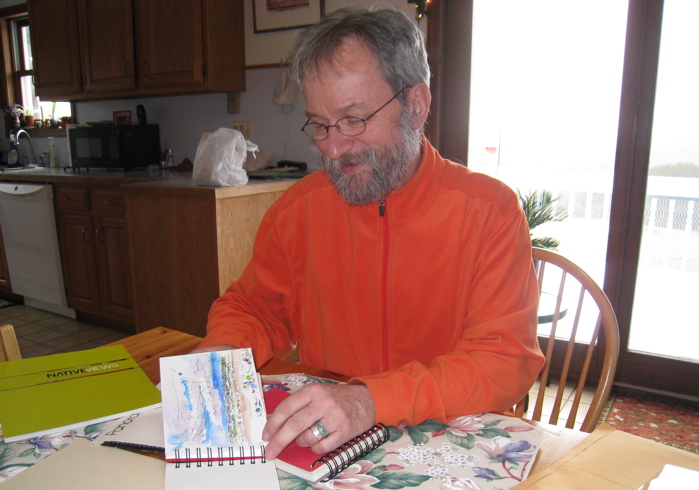
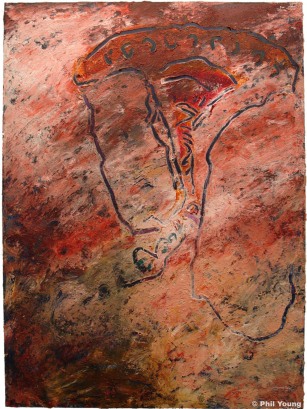
This is Phil Young, an inspiring and phenomenal Cherokee and Scotch-Irish artist. I had the pleasure of meeting Phil for the first time this past April when artist Gregg Emery (my husband) and I, did an artist talk at Hartwick College. Phil is my husband's college art professor and much more, they traveled together to the Southwest and Phil made a deep, resonating connection with Gregg. While we were visiting, Phil gave us intimate views of his most recent work and a special in-depth tour of his studio!! We were so fortunate to have this undivided time with Phil. Gregg and I own quite a few of his pieces of art from years back. However, his most recent work continues to be deeply provocative as Phil has been diagnosed with Multiple Sclerosis and comes face to face with this via his artwork. Since I have been known to do 'Inspiring Artists' posts, as I walked through his studio layered with a lifetime of art-making, I thought 'I'm so going to blog about this!!!' So here is a peek into the images, art and words of Phil Young.

py3.JPG

Phil Young MIXEDMEDIABLOODDOUBLEVISIONSCAPEARTIST


"This work is honoring the Creator, the Earth, our non-human neighbors, my family, and the communities from which I come, some of whom are still disconnected. It is also meant as a recognition of years of grappling with cultural outrage, invasive MS, and an affirmation of the powerful, loving beauty of this variegated world and my family stories to reclaim history and identity with hope, humor and healthy being."

Phil%20Young%202.JPG

"Each night I give myself a Copaxone shot, one of the medicines with some success at lowering the severity and rate of “progression” of Multiple Sclerosis. It is like meeting a friendly scorpion which acts as a decoy for the MS shark, feeding on the medicine instead of our bodies. This form of autoimmune disease attacks the myelin sheath around our nerves, much like insulation around electrical wires. So, when I’ve had double vision, or more recently, great difficulty walking, the messages from the brain and central nervous system don’t come through correctly."
Philyoung1.JPG

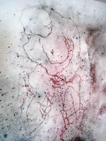
"The drawings often incorporate the back and front diagram of an “idea” body, printed on the instructions from the manufacturer of the medicine. Upon this graphic, muscularly healthy body are grids of injection sites to be rotated: the abdomen, the back of the upper arms, and the right and left hips. There are even warnings such as “inject at least two inches from the navel”. I have enlarged, cropped and printed these shot sites as black and white negative squares on clear acetate. The viewer can expect the unpredictable predictability of MS to generate narratives of continuity and disruption...


...The materials are red sandstone from my home state of Oklahoma, a mixture of charcoal, conte pencils, pastels transferred used to make a form of "carbon paper" (tracing paper), some iridescent acrylic (usually copper), and pencil on a(r)ches cover buff. The numbers were blind stamped into the paper from both sides, somewhat randomly, as were the areas of scratched and pounded points. Sometimes the charcoal and other dry drawing media were blown after they left random marks when the transfer paper was taken off. The tool to make the numbers was one that permanently put serial numbers on car engines and other parts. It will make impressions in steel. The small round puncture holes which also can be seen going in and sometime rising up are a graphic equivalent of giving me(the paper) a daily injection of my Multiple Sclerosis Copaxone medicine."
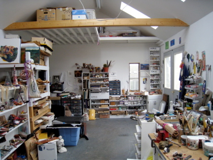
IMG_7021.JPG

This is a glimpse of the inside of Phil's studio. Phil built this studio himself and he built it on rafters so that the whole space could be picked up and moved where-ever he goes!! I find artist studio shots to be as much self-portraits as facial self portraits.
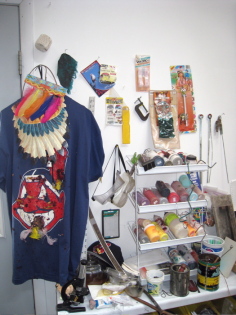
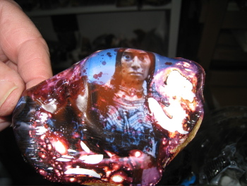
IMG_7026.JPGIMG_7028.JPG


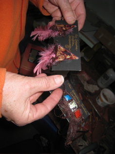
Here Phil is showing us an art piece that is a play on kitsch jewelry that is often found at trading posts.
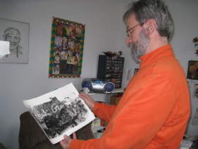

IMG_7025.JPG

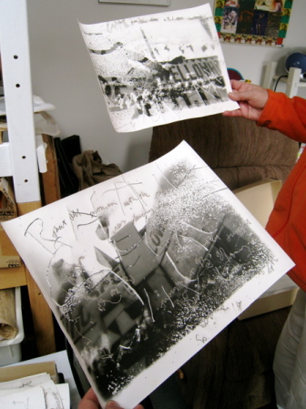
These photos from two series: “Trading Post Ruins: Delaminations and Cancellations” and the others from “Kinship”, both installations.
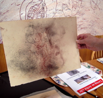
The process is; "I found Fiber based paper to be the right one to give me the quality and range of experimentation that I’ve sought since I began these. So, I go into the darkroom armed with the dremmel tool, hammer, Jerry’s mechanic stamping tool, nails, and in the Kinship series, a range of fishing hooks. In the dark, I begin to attack the paper, again from both sides, with the tools. I use the rather small pointed dremmel tool, again related to shots or pock marks, etc. and when used as a drawing line, it sometimes creates a surface like scarification of the skin or incisions. I also use permanent pigment pens, black, silver, copper. Writing is quasi-legible and again includes portions of family stories, some frenetic, Parkinsonian-like marks like my Dad had near the end of his life."

phil3.JPG

"After all the work on the photo paper, it is then exposed. Instead of putting the whole piece into the developer, I spray it like working on a painting. When the spray is more from the side, it catches on the raised scarification lines and reinforces a kind of topography. TP ruins pieces, the acetate is laid down on top of the paper before it is exposed, thus leaving a ghost like image of the words, which has some interesting ironies as related to some of the specific texts."

IMG_7018.JPG
Another kitsch jewelry piece!!

IMG_7019.JPG

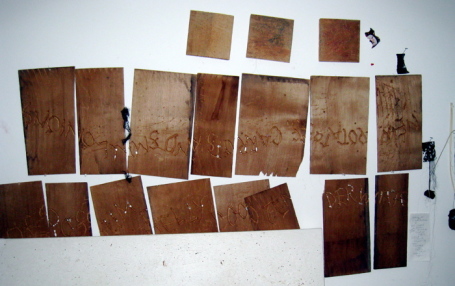
"The planks of wood are wooden cedar shingles, each of which are from a rejected bundle which has marvelous holes in them. What you saw are part of a series which I made which includes sections from a poem I wrote, “Wetumka”. What I did was use a dremmel to write in the letters. The marks are very much in line with the marks in the installation papers and that appear in my most “mature” paintings and drawing/collages. After this first stage of the “gouged” inscriptions, I go back and do some subtle painting by staining randomly to reinforce both deterioration and the elevation of family story (again some minor use of iridescent acrylics, hair, dried blood color). How these particular shingles will be displayed is yet to be determined."


1915508-1615717-thumbnail.jpg
Click on Image to See POSTCARDS!
IMG_7029.JPG

If you are interested in purchasing any of Phil Young's paintings (such as the one at the very beginning of this post), I found that Phil is represented by the Sam and Adele Golden Foundation. I hope you enjoyed this as much as I did, let me know!


Saturday
May312008

The Life of Pi Book Meme

One of my regular stops in the blogosphere is artist Beatriz Macia's blog Suitcase Contents. She is a Colombiana, living in Italy who is a phenomenal cook, artist and writer. I so enjoy reading about her adventures in cooking with her son called La Cucina de Nicola. But this week Beatriz introduced those of us who do not know, to what a meme is and she tagged me to do a book meme!!!


Now the rules of a book meme are as follows:
1. Pick up the nearest book.
2. Open to page 123.
3. Find the fifth sentence.
4. Post the next three sentences.
5. Tag five people, and acknowledge who tagged you.


0156030209.jpg

So my favorite book for the past four years is the Life of Pi, which is always by my night-stand (along with a stack of other books). As a passionate animal lover this book played an intensely powerful role in my spiritual awakening. I have found the best way to surmise my spiritual feelings is that I see the face of God in animals and in nature. In fact, I feel dark when I kill insects unnecessarily and I have...but I digress. This book is about a young Indian boy, named Pi Patel who is a zoo owners' son and his journey through survival.


Here is the meme for my paperback copy since - depending on what copy of the book you have you will get different results.


"He was too far. But the sight of the lifebuoy flying his way gave him hope. He revived and started beating the water with vigorous, desperate strokes."


I found this amazing interactive (you can play with your keyboard) computer animated promo for the book at Hoss Gifford, Life of Pi Interactive Promo, that I HIGHLY recommend to my readers!!!


In addition, there are tons (not so good) Youtube video dramatizations and animations based on the book, but I rather enjoyed this one, (though the music gets a bit loud...) that I embedded here:


I also found this incredible image through my travels on the Blogosphere at a site called Worth1000 which to my understanding hosts Photoshop contests. If you click on the link you'll have to scroll down to see the Life of Pi image, that I'm writing about here, but you'll also see in on the top header. Thanks form a tip from fellow blogger Paisley, Worth 1000 doesn't like anyone to use their images without permission (even with credit and a link back- which as an artist I guess I understand). Which is why you don't see the image I am talking about here. The only info that I could find about the artist was the name melian1224. This image is amazing and is worth you clicking and looking for!! This is the artist's quote:


"After the sinking of a cargo ship, a single solitary lifeboat remains bobbing on the surface of the wild, blue Pacific. The crew of the surviving vessel consists of a hyena, and orangutan, a zebra with a broken leg, a 450-pound Royal Bengal tiger, and Pi Patel, a young Indian boy. This is one of my favorite books, one which I just had to bring to life, I hope I have done it justice!"

I hope you guys have enjoyed this book meme! Stay tuned for my next post which is a Inspiring Artist post on artist Phil Young. I haven't done an Inspiring artist post in a while so I'm looking forward to it as I hope you all are too!! In addition I had some interest in the Giveaway idea so I may do the first one in June...so stay tuned!!!


Tuesday
May272008

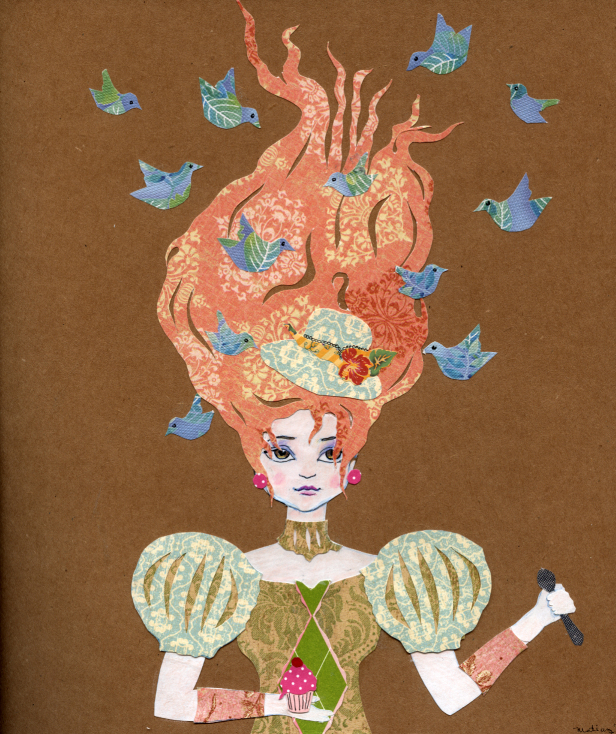
Marie Antoinette Inspired Collage

Marie%20Antoinette1.jpg


I'm getting ready to write another 'Inspiring Artist' Blog, but until I have all my facts straight I thought I would share another collage with you all!!! I did this one right after I returned from the Europe trip. It is directly related to the images, Laduree treats, color and Marie Antoinette Exhibit that I saw while I was in Paris (See past posts). I cannot tell you how relaxing collaging like this is!!


Soon I'll be putting prints of my collages up for sale on Etsy...but I've also been inspired by other creative bloggers to do GIVEAWAYS once a month of collage prints - so let me know if you would be interested in me- doing that kind of thing. I was thinking I would post the small artwork as Giveaway art, then choose a 'comment' to which I send the piece to FOR FREE!!!! I believe in exchanging too, so lets see how this goes! Anybody interested in me doing this??